
UI design and consistency go hand in hand in crafting a good visual experience for your users. When it comes to responsive web design we are talking about different screen sizes that make it easier for the user to detect any inconsistencies and flaws and it can drive even the most promising products to failure.
This blog is about the best practices designers can approach to meet user expectations
What consistency stands for in UI design?
Consistency in UI design refers to making sure that every element composing the user interface is uniform and coherently behaving to deliver a constant user experience throughout every page of the digital product conveniently with screen size and device UI guidelines.
Keeping up with high consistency in UI web design
Consistency never means the restriction of designer freedom to create and innovate, Instead it sets basic guidelines to follow in order to provide a familiar and reliable user experience.
Here are the best practices recommended by our experts to guarantee consistency in your web UI designs:
Conduct proper research and Analytics
In order to match your design with the user expectations, you need to define the exact user needs behind the digital product you are working on. Empathizing is one of the core values of design thinking that helps designer design with the eye of a user and so keep the user experience consistent throughout every screen.
Pay attention to Internal and external consistency
User expectations are built through their previous experiences with similar digital products. Consistency plays a key role in guaranteeing the ease of use of the website with a reliable conventional design that matches design standards (external consistency). But you also need to keep pages integrable and consistent with each other (internal consistency)
Continuous Usability Testing
Let real users test how functional is your design and how practical and easy it is to navigate through it in order to:
- generate useful insights
- understand the user behavior toward your design
- detect flaws and improve the design through feedback
- Validate your prototype
Conducting usability tests before and during the design process improves consistency. You can opt for card sorting, user interviewing, reviews, in-person or remote tests, and other methods.
Understand carefully Device UI Guidelines and Behaviors
UI design has no size fit all, Different platforms have different UI and usability guidelines. iOS human interfaces are particular and so are Android ones. Having the necessary knowledge about specific guidelines helps you make adjustments on each version designed for each device and keep up with consistency.
Conduct Heuristic Evaluations
Heuristic evaluations are great for ensuring external consistency since on the competition level. While traditionally heuristic evaluations are used to test usability problems or feature audits, before the design they can outline the current state of the market you’re getting into by determining competition fields with your competitors example colors. In other words, in what fields will you be competing with your rivals, and in which areas are it possible to surpass them?
Comparison can be done on the following levels
- Visual impact
- Visual hierarchy
- Ease of navigation
- The simplicity of user input
Consider implementing a design system
Consistency isn’t something you add once the design is finished, it’s a whole mindset, a process, and a pathway to meet user expectations, which is the core to all aspects of design.
Implementing a design system within your work helps you set complete consistency as A design system operates as a team far from just integrating static design files and pattern documentation! Unlike a pattern library that only operates as a collection of components, a design system is meant to create functioning UI components that can be used to build real software applications, emphasize early browzing, enhance perfect front-end code iteration, and provide necessary guidelines to ultimate consistency and meaningful production.
When the pattern library only projects the superficial what of the project, a design system deeply conceptualizes the meaningful why That delivers an actual user experience & exceptional consistency.
Why Arsenic design system?
Arsenic was built to serve consistency to all designs and nothing less
A true guide to your Brand identity language
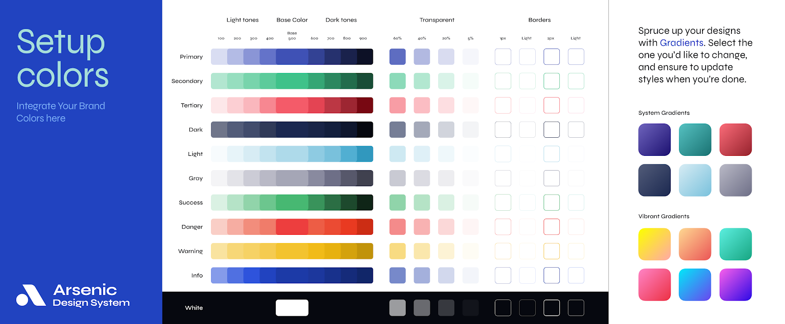
All adjectives of the brand align with its identity. Arsenic is meant to maintain high-quality consistency throughout every design and project by providing necessary guides to brand identity with detailed toolbars that control for discernible components that you’ll use to construct your digital product.
Consistent Components & patterns
Components & Patterns are the elements that can be delivered consistently only with the integration of a design system. Arsenic design system provides a best practice that leads teams throughout the design process and adequate components and patterns accordingly with every typology of a digital product.
Operates as a visible pathway and powerful consistent workflow
Arsenic design system enables interdepartmental collaboration for efficient workflow by providing control over every component with respective coding in perfect consistency as well playing the role of useful documentation.
Take Arsenic as your next team player!
Arsenic Operates as a team and serves a team as if aligns members around a clear set of shared goals. It is meant to operate as a team itself by reducing the failed attempts of synchronization between different departments and the bother to visually design every state of every screen while you can think more efficiently and operate by Assembling all components Line of UX/UI in a contribution space.


