Does extensive use of graphics enhance usability?
The user interface or UI is the magical element X that sets your project attractiveness on fire. Its primary objective is to provide easy, enjoyable, and effective interaction between the user and the digital product. It included all the control, buttons, and blocks of the app. When it comes to e-commerce UI is sensitive as it affects the user’s decision to shop.
Types of User interfaces
There are four main types of user interface:
Command Line Interface
With an instruction-based functioning design, Command Line Interface is simple and minimalistic and works best with data-heavy digital products.
Menu-Driven Interface
Provided a range of options in a list or menu displayed in full-screen, pop-up, pull-down, or drop-down.
Graphical User Interface
Tactile or non-tactil GUI is based on click commands on graphics or icons to take action in a user-friendly way. It allows the running of multiple applications, programs, and tasks simultaneously.
Touchscreen Graphical User Interface
The touchscreen GUI provides a touchable experience with the use of fingers or a stylus to select icons and perform tasks, rather than a mouse or trackpad.
Ecommerce UI features
The current, top e-commerce apps are Nike, Apple, Samsung, eBay, Chewy, Banggood, Drop, Amazon, and Best Buy. Here are the best UI features used in those successful apps
Flexible sign-in
Spending more than one minute on a heavy Sign-in is enough to push any user to look elsewhere. The lazy sign-in method commonly used in e-commerce UIs allows the user to have the option to shop without signing in till he reaches the cart where he can use external sign in.
Search by: text, image, voice, barcode
Text-based search is no longer enough, images, voice-over and barcode are on their way to replace the keyboard. Scanning a barcode reduces possibilities of error, and leads you straight to the needed product.
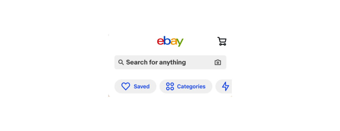
Browse by: product categories
Product categories allow users to browse and discover products in an organized way by grouping products according to categories. Some e-commerce UIs have a separate product category screen while others integrate the product category section in the home section.
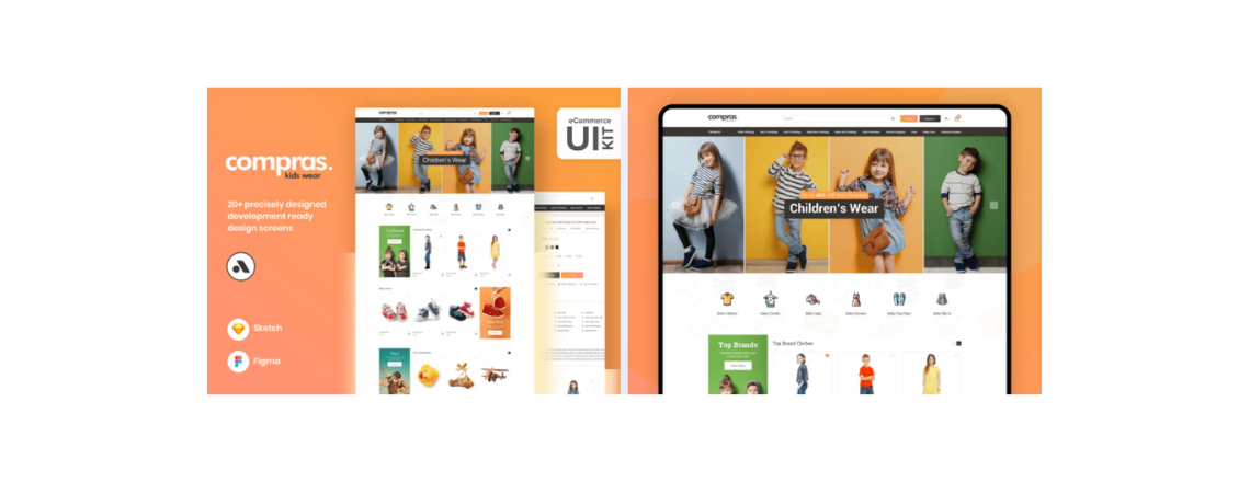
Check this UI design made by Arsenic Design System
Variety of call to action buttons
Different CTA escorts the user into his shopping journey. Buttons like “Save”, “Add to cart”, and “Buy now” help the user shop comfortably and take different decisions without the pressure to buy.
Information hierarchy boxes
Successful UI the one that displays the right amount of information clearly nothing more and nothing less. Designing forms and information in a list, or progress indicator is the most useful and visually appealing way.
Instantly visible branding
Make sure your UI showcases your brand via a set of distinguishing features and promoting awareness and recognizability of the product or service on the market.
Branding is so essential in an e-commerce user interface design! The color palette, shapes, typefaces and fonts, illustrations, and icons must be in consideration to the appropriate and corresponding branding concept.
Arsenic Design System: A true guide to your Brand identity language
Arsenic Design System: A true guide to your Brand identity language
All adjectives of the brand align with its identity. Arsenic is meant to maintain high-quality consistency throughout every design and project by providing necessary guides to brand identity with detailed toolbars that control for discernible components that you’ll use to construct your digital product.
Specify the purpose of the landing pages
E-commerce UI design operations are usually based on dealing with complex websites or apps which are overloaded with info. Users shouldn’t get distracted or annoyed with the amount of data they have to process finding what they need. Landing pages should be used when you need to attract a user’s attention to a specific item.
Consider Arsenic Design System to design the best e-commerce UIs
Take Arsenic as your next team player to build powerful e-commerce UIs. with Arsenic why bother to visually design every state of every screen while you can think more efficiently and operate by Assembling all components Line of UX/UI in a contribution space.

