
A successful product design, in terms of UX, always depends on two factors, which are consistency and predictability. Over the years, the design team working on the same project has faced a lot of difficulties. A solution to a problem varies regarding everyone’s opinions which results in discrepancies and incoherent experience for the users.
What is a Design System & Why is It Needed?
The biggest answer to flush these inconsistencies and incoherence between the team members is the design system. A collection of rules, tools, and processes which simplify designing with standards, consistency, efficiency to develop digital products is called a design system.
The most basic thing about the design system is to maintain the design at a scale. Crafting a design system focuses on establishing independent foundations for color, typography, grids, texture and the like. To dig into the design system, a designer must know the basics of atomic design too.
Google, Airbnb, Uber, IBM, Shopify, and other giants have changed the ways they design digital products by incorporating their own unique design systems. The design system created is used by teams for reusability of components with a standardized design methodology. This brings more consistency, faster iterations, and uniform design experience.
What is Atomic Design?
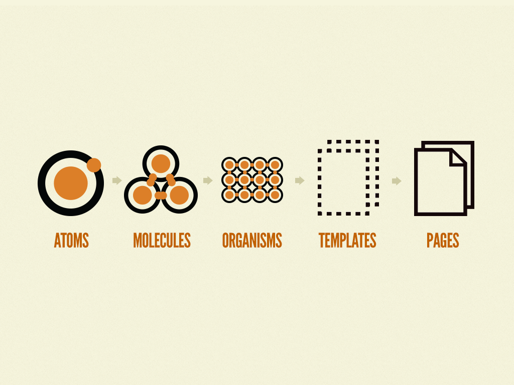
In its true sense, the atomic design system is an innovative component-driven way of designing websites and mobile applications. In layman’s terms, Atomic design is a design methodology to work on atoms, molecules, organisms, templates, and pages concurrently to create effective interface design systems, in less time.
Let us clear the term and concept here. You may know that any matter, whether it is solid, liquid, gas, simple, complex, etc., is made of the smallest particles called atoms. Atoms bond together to create molecules, and molecules combine to form organisms, which create everything.
Likewise, we can break interfaces down into building blocks and work up from the very bottom of it, from the atom stage itself if needed. That’s the basic gist of atomic design.
5 Stages of Atomic Design
Please don’t panic. Friends, we are not going back to chemistry subjects of high school, but the system might force you to relive your memories if you were a science student. Every stage of atomic design plays a pivotal role in the hierarchy of all interface designs of a website, mobile app or any software design product.
The atomic design methodology in software design process can be broken into following five stages:
Atoms
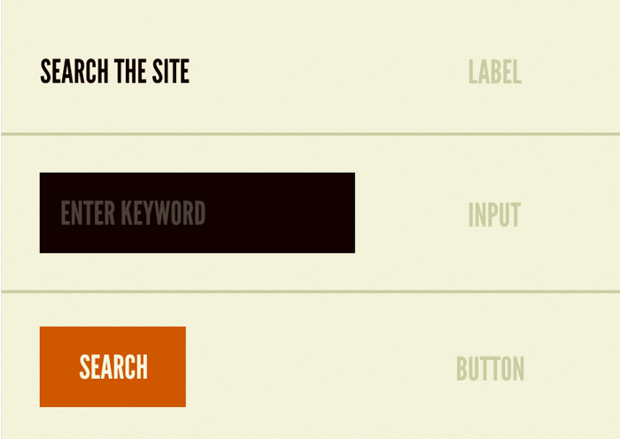
Atoms are the elements or building blocks such as HTML tags or labels. Atoms can also be shapes, color, typography (fonts), animations, headers, paragraphs, etc. It could be anything that can merge with other atoms and transform into a molecule.
Molecules

Elements or things such as form fields with a label or a table with headings and data columns can be considered as molecules. Groups of two or more atoms held together by chemical bonds form molecules. Molecules are even more tangible and functional than atoms. For interfaces, molecules are groups of UI elements working together to become more functional.
Organisms

More complex organisms are composed by combining molecules together. Organisms are clusters of molecules functioning as a unit. If we consider a header section, it may use different elements such as a logo image, primary navigation list, search form, etc. Every website owns such organisms, isn’t it?
Templates
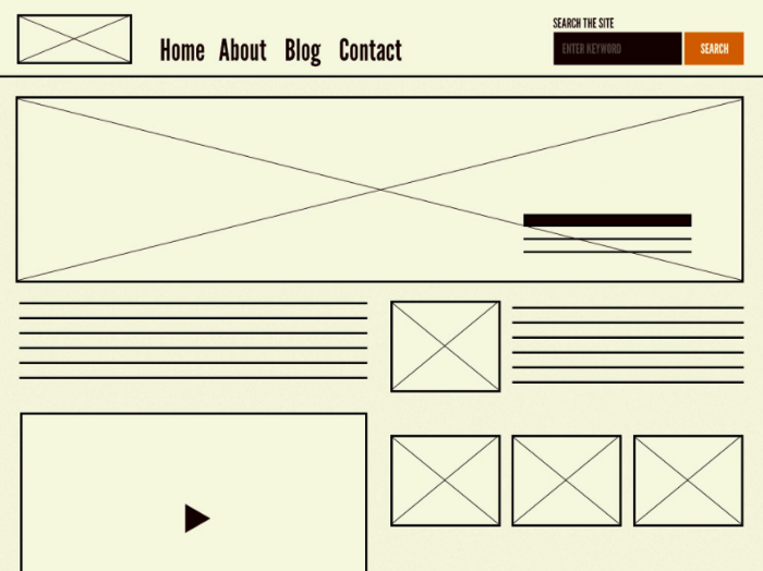
A template is a combination of multiple organisms functioning together to provide a meaningful, user friendly UI & UX experience. Templates are objects for creating pages. Templates place components into a defined layout and bring life to the design’s underlying content structure. Imagine an organism (a header section) being placed in a homepage template (layout).
Pages
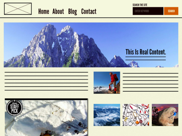
While templates are the skeletal system of the interface design, pages are the meat and bones, the real content which could be anything – images, videos, texts, action items.
Page is what users will see and interact with when they visit your experience. This makes it the most concrete and critical area of all. This is what matters to the stakeholders. Page is the presentation of all those individual elements and components coming together to form an appealing functional UI.
Best Reasons to Use Atomic Design System
To finish it off, let us quickly have a look at the best benefits of using an Atomic Design System.
- Giants like Google, IBM, Polaris, Shopify, Salesforce, Adobe, etc. are having atomic design system of their own. It’s reliable.
- Component driven design system makes it easier to mix and match components.
- No rocket science, simple to understand style guide.
- Knowledge transfer to a new dev team becomes easy along with a codebase.
- Inclusion of Pattern Lab makes atomic design easier with consistent code.
- Speedy and efficient design prototyping.
- Update or remove organisms, molecules, atoms or the whole template effortlessly.

