Basics of Visual Design
Whoever said don’t judge a book by its cover knew nothing! People always tend to judge a book by its cover and therefore stands the visual design concept. The way a product looks affects the way the user experiences it.
Visual VS Graphic design
The term Visual design is often confused with graphic design and UI design, though they all fall under the same umbrella they do serve slightly different aspects.
Visual design is all about the necessary aesthetics for an appealing digital solution. it is strategically planned through the implementation of different elements. While a Graphic designer’s role is to generally communicate the specific message through artistic design, a Visual designer’s role is to craft a consistent a unified image of the product across digital communication platforms with a hybrid skill mix between graphic and UI design skills and deep consideration to UX design and web design.
This blog will make you explore the basics of the visual design world from its elements to its fundamental principles.
The role of visual design in UX
Visual design plays a major role in smoothening the user experience by creating products with pleasing aesthetics.
It helps on many levels:
- The way a product looks affects the way the user experiences it.
- Aesthetically-pleasing products push the user to ignore some usability flaws (it doesn’t mean that your product should be nothing less than usable)
- Visual design enhances the interaction between the screen and the user through strategic implementation of text, colors, and images
- Drives the user’s eye through a coherent path of usability of correct information and functionality by visually highlighting the right content.
- Good visual design enables a designer to go from concept (low-fidelity) to product (high-fidelity).
- It enhances the trust of the users in the product
Key Elements of Visual Design
Creating visual designs is a matter of combining different elements
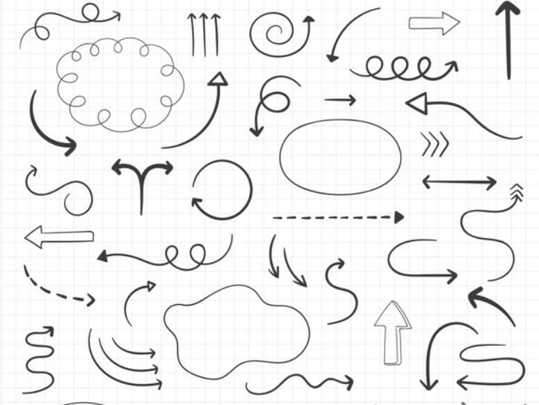
- Lines: strokes connecting two points to define shapes create divisions, patterns, and textures with different lengths, widths, and directions. They can convey different images and expressions by leveraging their properties like thick/thin, straight/curved, geometric/organic..etc
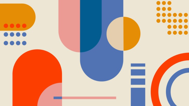
- Shapes are two-dimensional self-contained areas built with lines, color, texture, etc. A group of shapes can compose objects.
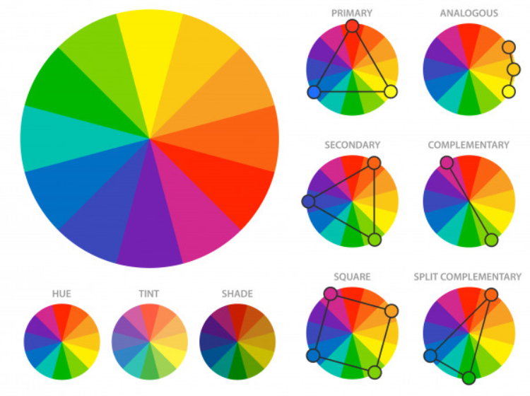
- Color palette choices and combinations are used to differentiate items, create depth, add emphasis, and/or help organize information. The color theory is based on usage and mixture of color in design and examines how various choices psychologically impact users by making different combinations in order to create visuality and depth in elements. There are colors that mix subtractively and colors that mix additively.
- Texture refers to how a surface is perceived to feel. Depending on how a texture is applied, it may be used strategically to attract or deter the attention of the user.
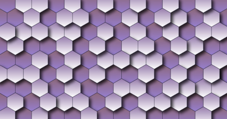
- Typography chosen fonts, their size, alignment, color, and spacing.
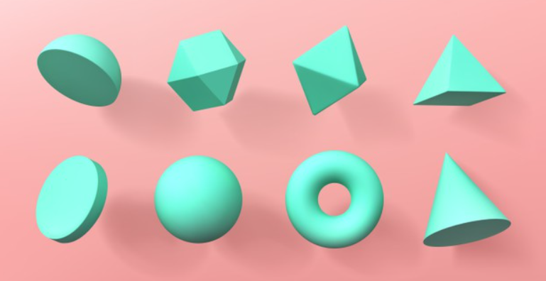
- Volume: referring to 3-dimensional visuals with width, length, and depth.
- Value: refers to the Light value vs. dark value. The contrast of values in design enhances clarity while the opposite creates subtlety.
The Basic principles of visual design
The world of design doesn’t operate randomly, it follows strict laws. A successful visual design strategically combines the elements noted above to deliver “ a visual experience” by applying the following principles:
- Unity refers to the creation of a sense of harmony between elements on a page. Elements should be conceptually arranged together by balancing unity and variety to avoid repetition and dullness.
- Gestalt the opposition of the overall design and the individual elements helps users perceive the page better as we tend to perceive the overall shape of an object first, before perceiving the details
- Space Incorporating space into a design increases readability and creates illusion. White spaces play an important part in layout strategies.
- Hierarchy by showing a difference in significance between items through different font sizes, colors, and placement on the page.
- Balance equal distribution of elements does not force symmetry
- Contrast making items stand out by emphasizing different characteristics.
- Scale applying a wide range of sizes
- Dominance Having one element as the focal point and others being subordinate through scaling and contrasting
- Similarity it is used to help the user learn the interface quicker
Conclusion
The fundamental blocks of a digital product are built with visual design elements in applications of several design principles.

